A proposal I made while at Wieden + Kennedy.
The Ask:
Make this a better looking and more user-friendly experience.
Assessment: A lot of content and too little visual organization.
Also, missed opportunities for SEO with much of the inbound links leading to pdf's that were uploaded to the server.
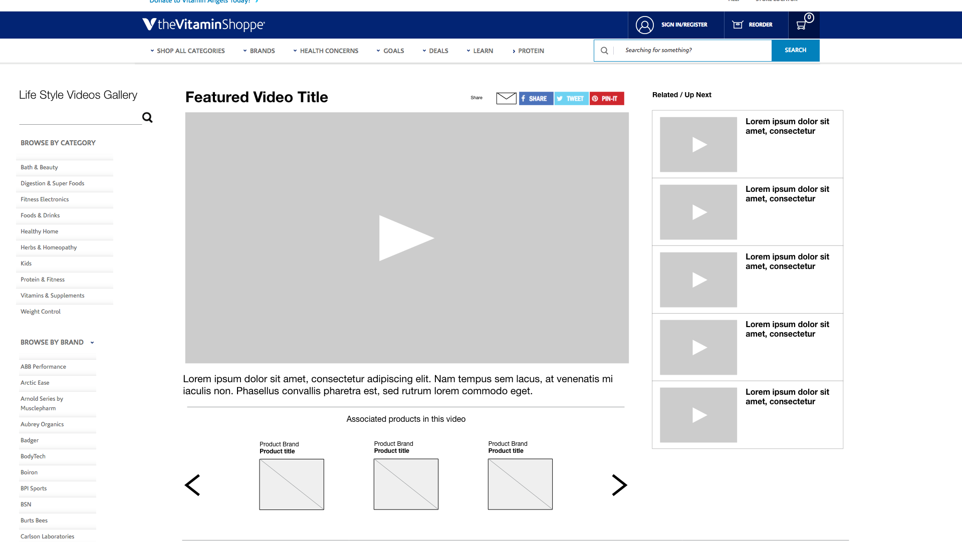
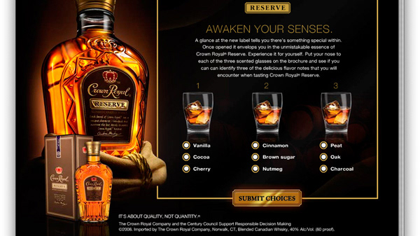
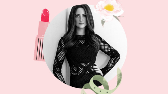
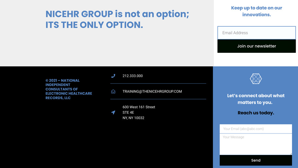
Below are several home page feels and in subpages that helped them rethink on where they were VS where they could be.
Luckily, the website was built in Wordpress. I explained to the clients that they were using a platform that would allow scalability and flexibility for change, visually and functionally, making this presentation of ideas much easier for them to digest and empower them in collaborating with developers and designers in the future.
If you see their site now, you'll see I left an influencing impression however I was not part of the production to come or maintaining of the site.
